OUGD405 Studio Brief 4 - Research
To begin with I started off my researching into competitors and different travel websites that my website could lead onto for booking with. The first obvious choice was Bucketlist.org, through looking through it was a really clear, well designed website but I found that the limitation was with it that once you write your bucket lists, thats it. People can still neglect this bucket list online just as well as a written one, therefore I think my website will have an edge as it will find places and offeres for you to complete them, its not just an online bucket list.

Next I found The Lonely Planet to be a big competitor as the site not only has its guides and tips for travel, but it also allows you to book through it as well. It has a similar style as the website uses 3rd party travel websites but you can book through the Lonely Planet, which is what I want my website to also do. There thing that really strikes me about this website is its layout. I really love the homepage and the grid system its uses. I like the use of relating images to the boxes and feel it is really striking as a web design layout. This is something I would like to look to include in part of my website.

Lastminute.com is a good example of competition as it includes a range of different experiences and travel and also has filtering for price ranges and location. However I think a problem with this website for me is that it aimed more for adults who want to experience '5 star lifestyle for three star prices,' therefore I feel the main focus of this website is for cheaper holidays and city breaks. For my website I would rather aim this more for students and a younger audience and have travelling to be a main section of the website rather than holidays. This is a good website however to start from and I think it has a really nice layout to work from.

This feature on 'G Adventures' website of having an image full screen, I really love the layout because its so imposing, I think photographs have a large impact and and are key to travel related pages, so why not have such a large, imposing picture? I think visually it looks stunning and makes a much more interesting website.

This website I found is an example of experiences that its audiences can buy. However I think this is a poorly designed website, mainly due to the fact that are no images and only its logo. Overall it isn't a very appealing website and I think the use of colour is bland. In terms of the layout, the site is easy to navigate around and led me to find that it was actually for gifts only. This is still useful however and I do like the idea of a second navigator menu to help users get their way around.

Virgin Experience Days was another really useful site to look at. I think the options for the tabs are easy to navigate around and the design of the website is clear and consistent of Virgin's company colours. The Filter options were also interesting to look at to see which options they put onto there such as Location, Occasion and Price Range.

Creative's Blogs '20 Steps to the perfect Website'
01. Put your thoughts on paper first

02. Start sketching a top level framework

When I'm asked to create a look and feel for a project, the first thing I do is come-up with a top level framework that solves all the design problems. The framework is the UI that surrounds the content and helps to perform actions and navigate through it. It includes the navigation and components like sidebars and bottom bars.
If you approach your design from this perspective you will have a clear understanding of what your layout needs will be when designing sections beyond the homepage.
03. Add a grid to your PSD

It's as simple as it sounds. Before starting to design anything in Photoshop you need a proper grid to start with. There are no valid excuses for starting without a grid, and yes if you don't, I can assure in one way or another, the design won't look as good.
A grid will help you to structure the layout of the different sections; it will guide you through the specific screen size requirements, and help you to create responsive templates, to be consistent in terms of spacing as well as many other design issues.
04. Choose your typography
.jpg)
05. Select your colour theme

Throughout the process of choosing a set of typefaces to use you should start exploring what colours you will use in the UI, backgrounds, and text. In terms of colours I recommend using a limited set of colours and tones for the general user interface.
It's important to apply those consistently across the UI depending on the element's functionality. Think about the layout of sites like Facebook, Twitter, Quora, and Vimeo. Besides the UI there shouldn't be any colour restriction for illustrations or graphic details as long as they don't interfere with the functionality of the components.
06. Divide the layout

Each section in your site needs to tell a story. It needs a reason and a final outcome for the user. The layout needs to help the content highlighting what are the most important pieces in that story. In reality there shouldn't be too many call outs on a page so everything should drive to that final "What can I do here".
Think about the most simple layout you can imagine for a simple purpose and start adding components that are necessary. At the end you'll be surprise how hard is to keep it simple.
07. Rethink the established

08. Challenge yourself
I encourage every designer out there to challenge themselves on every project. Innovation doesn't always come as a requirement for the project so it's up to us to come up with something interaction or design related. Examples of different challenges could include using a new grid system, creating a new component, or even minor challenges like avoiding blend modes or using a specific colour.09. Pay attention to the details

This statement has been overused lately but it's not always visible in the final product. Depending on the concept behind the project, that "love" could come in different ways.
It could be a small interaction, an unexpected animation or an aesthetic touch like a little gradient in a button or a subtle stroke around a box in the background. But overall this touch is essential and also natural if you really enjoy what you do.
10. Treat every component as if it could be presented to a design contest

Website Grids


Below we explore the top 10 web design principles that will make your website aesthetically pleasing, easy to use, engaging, and effective.
1. PURPOSE
Good web design always caters to the needs of the user. Are your web visitors looking for information, entertainment, some type of interaction, or to transact with your business? Each page of your website needs to have a clear purpose, and to fulfill a specific need for your website users in the most effective way possible.
2. COMMUNICATION
People on the web tend to want information quickly, so it is important to communicate clearly, and make your information easy to read and digest. Some effective tactics to include in your web design include: organising information using headlines and sub headlines, using bullet points instead of long windy sentences, and cutting the waffle.
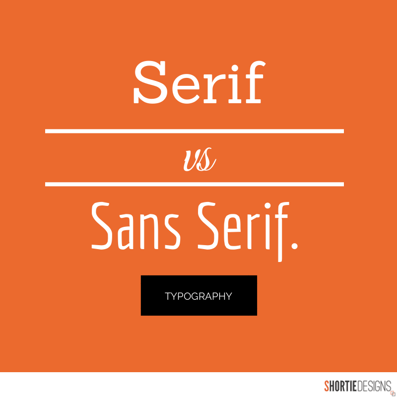
3. TYPEFACES
In general, Sans Serif fonts such as Arial and Verdana are easier to read online (Sans Serif fonts are contemporary looking fonts without decorative finishes). The ideal font size for reading easily online is 16px and stick to a maximum of 3 typefaces in a maximum of 3 point sizes to keep your design streamlined.
4. COLOURS
A well thought out colour palette can go a long way to enhance the user experience. Complementary colours create balance and harmony. Using contrasting colours for the text and background will make reading easier on the eye. Vibrant colours create emotion and should be used sparingly (e.g. for buttons and call to actions). Last but not least, white space/ negative space is very effective at giving your website a modern and uncluttered look.
5. IMAGES
A picture can speak a thousand words, and choosing the right images for your website can help with brand positioning and connecting with your target audience. If you don’t have high quality professional photos on hand, consider purchasing stock photos to lift the look of your website. Also consider using infographics, videos and graphics as these can be much more effective at communicating than even the most well written piece of text.
6. NAVIGATION
Navigation is about how easy it is for people to take action and move around your website. Some tactics for effective navigation include a logical page hierarchy, using bread crumbs, designing clickable buttons, and following the ‘three click rule’ which means users will be able to find the information they are looking for within three clicks.
7. GRID BASED LAYOUTS
Placing content randomly on your web page can end up with a haphazard appearance that is messy. Grid based layouts arrange content into sections, columns and boxes that line up and feel balanced, which leads to a better looking website design.
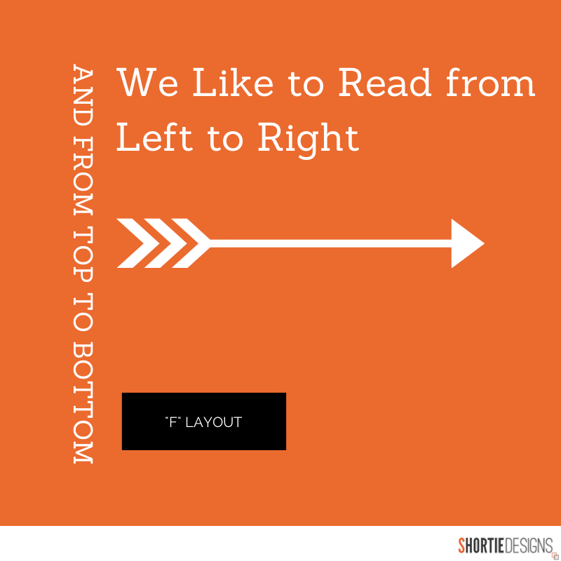
8. “F” PATTERN DESIGN
Eye tracking studies have identified that people scan computer screens in an “F” pattern. Most of what people see is in the top and left of the screen and the right side of the screen is rarely seen. Rather than trying to force the viewer’s visual flow, effectively designed websites will work with a reader’s natural behaviour and display information in order of importance (left to right, and top to bottom).
9. LOAD TIME
Everybody hates a website that takes ages to load. Tips to make page load times more effective include optimising image sizes (size and scale), combining code into a central CSS or JavaScript file (this reduces HTTP requests) and minify HTML, CSS, JavaScript (compressed to speed up their load time).
10: MOBILE FRIENDLY
It is now commonplace to access websites from multiple devices with multiple screen sizes, so it is important to consider if your website is mobile friendly. If your website is not mobile friendly, you can either rebuild it in a responsive layout (this means your website will adjust to different screen widths) or you can build a dedicated mobile site (a separate website optimised specifically for mobile users).
No comments:
Post a Comment